<FIVE>
<FIVE> code guides to teach designers about the web code process. The guides cover HTML, CSS, Javascript, PHP, React, and Git. Mainly targeted towards beginners and intermediate developers.
Time Period
Scattered 4 Months + 2 weeks of refinement
Contribution / Focus
Research, Mentorship, UI Design, Coding, Workshop Presentations
Tools
- User Interviews
- Personas
- Adobe Illustrator
- Figma
- HTML
- CSS
- Javascript
Let’s learn to <Code />
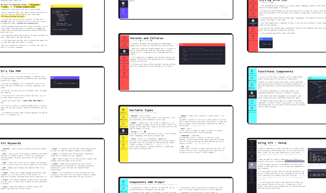
The Five presentations - <FIVE> - tackle code issues in a hybrid workshop/website. Understanding web code has become almost a necessity in the design field. As such, <FIVE> covers a variety of languages to give designers a bigger picture of the dev workflow. Each site aims to give beginners the tools and resources to understand simple code blocks.
The websites cover:
-
HTML & CSS
-
Javascript
-
PHP & SQL
-
Git
-
React
How do students learn development?
Learning to code is an incredibly diverse and complex topic. One that needed to be clarified to proceed in the process of making a solution.
How can I help guide design students age 18-26 to better understand a variety of different web coding languages?
Say “No” to dry video tutorials
The common solution to this issue would be mentorship and/or video tutorials. After being a mentor for 3 years in my program and not seeing much of a change I knew there was more I could do. Here are a few key assumptions I had to make when creating the solutions.
-
Students will want to use <FIVE> over W3Schools or other available tools. While learning, students will often use different sources of information. So it is important to look at how information is presented.
-
Individuals will learn something from the solution. Different individuals learn through different methods. So it's vital to keep the tone of the site and interactions inclusive to different learning styles.
-
Designers will have varying interests and skill levels. Designers, especially within the Interaction Design program have different design focuses. I have to ensure that both beginners and novices' needs are met.
These realizations broadened the scope of the solution. The solution would have to scale, be reusable, and adapt to a user's needs.
What even is a <div />
I began by talking to directly to students who needed mentorship and coding support. I conducted one wave of 1-on-1 interviews where I learned that there was a huge disparity in what they were being taught and what they didn’t understand.
-
Some students didn’t know what the limits were to code. And did not know how to start to create their ideas.
-
Others seemed to lack resources and terminology.
-
Some just generally needed added reinforcement to their learning in an applicable way.
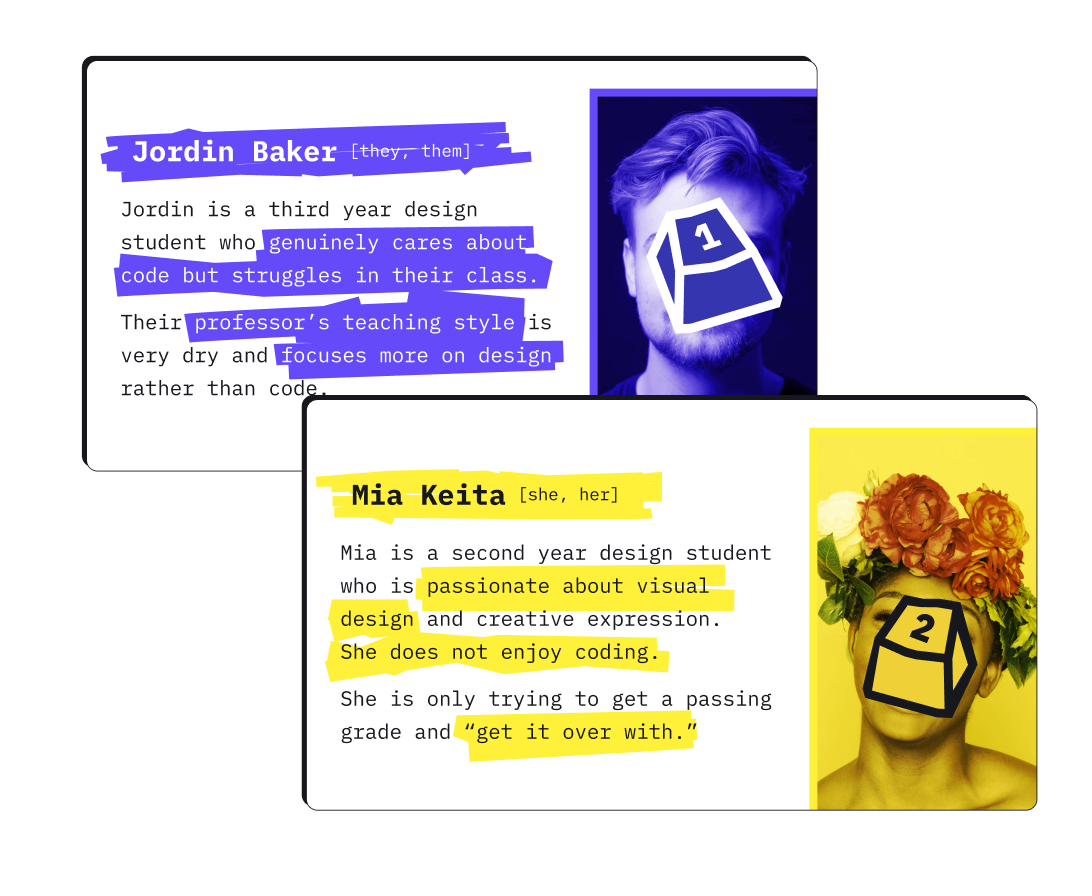
I also created some simple personas to better illustrate the solution I was trying to make. I referred back to my personas' struggles and successes during the design process as a constraint. They helped to more clearly visualize a knowledge gap.
The primary function()
With those findings in mind my goal quickly became:
How can I provide design students aged 18-26 with code support and a resource that allows them to complete their projects?
Time to design some code?!
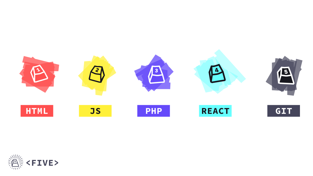
I opted for a minimalistic colour palette based on the code logos for each of the languages. I also wanted to let the content shine by not having too many graphics or contrasting colours. Each of the <FIVE> had their primary colour which paired with a white or off-black to create an accessible palette.
I also had the unique constraint of making it referable. I had to ensure that someone could reference any of the information with ease. This meant that I had to pay close attention to information architecture. The wording used to describe code needed to be both technical but accessible.
As for "presentability", the designs were fluid to allow the site to flow on different devices. This unique constraint led to the side scrolling navigation. The nav bar on the left changes as you reach different parts of the page. This helped users to navigate the large site with confidence. It also helped with timing and pacing while presenting.
So much to do! So much to observe()
The coding process went by relatively quickly after all of the content had been written and designs had been finished. I had made the layout relatively straight-forward which allowed for “plug-and-play” data. I was able to very easily copy and paste content once base styles had been declared.
The unique left nav was definitely a challenge, it needed to be “dynamic” and react to different section changes. That logic was done using an “intersection observer” and checking whether or not the screen was in a new section. Changes to the sections would then be reflected in the nav.
I also implemented the use of arrow keys and the enter button to navigate. This helped when it came to presenting the websites as workshops.
All Five together at last!
The final <FIVE> were a success when completed. They were full of useful info for designers to take with them and were all device friendly. I ended up presenting ⅘ of the guides to peers, which were incredibly well received. The <FIVE> can be explored here:
5/100 ? or 500/100!
After having created these guides I can confidently say that they were done well! After presenting and distributing the Five I heard nothing but glowing reviews from classmates. Each of the presentations were booked fully up and aside from some minor typos everything was superb.
All of that being said, the scrolling nav (as gimmicky as it is) did satisfy its purpose. The solution was definitely a point of growth where I was able to create something within an incredibly specific constraint. It required me to think out of the box and work with my knowledge of dev. It could’ve used much more user testing however (it was a bit awkward to interact with).
What’s next for this.project
The language and content in the <FIVE> are continuing to be refined. Languages are constantly changing, growing, or shrinking which needs to be reflected in the guides.
The <FIVE> are definitely due for a content revision to make sure that everything is up to date.
